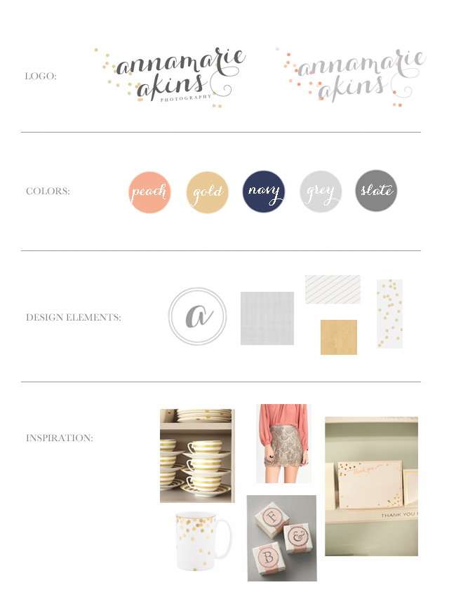
I’M SO EXCITED!!! My new logo is finally ready to be shared with the world…
This was probably the HARDEST part of the rebrand…deciding on how my new logo should look! Krista, my designer, literally sent me pages of mockups of various styles of logos and slowly we began to narrow it down and make it perfect! I love the slanted text which is a font that Krista tweaked to make it more unique…One of my all time favorite logos is Hey Gorgeous Events pretty hand drawn one..so we took the slanted idea from that…And the confetti dots are based on the confetti line by Kate Spade…I think it’s so fun, but still classy! I wanted it to feel girly but sophisticated and more high end. Krista did such a good job and she was so patient as I figured out what I wanted…It’s funny because I feel like once you stare at logo’s for so long it all becomes a blur and it’s hard to figure out what you really like…but when I saw this version of it I loved it right away!
I like how it commands attention…The rest of my new site has lots of clean lines because we wanted a lot of the focus to be on the logo! Another thing I love about it is that the text is pretty standing alone without the confetti dots too…You’ll notice on my business cards (which I’ll share next week! AHH I love them!!) that the dots are arranged differently and I just love that it can be modified for a little variation…
I hope you love it as much as I do!! Especially you AAP brides reading this! I’d love to hear your thoughts..Happy Wednesday!

April 3rd, 2013 at 4:57 pm
SO beautiful!!! Love it!
April 3rd, 2013 at 5:01 pm
So great!! Congratulations! : )
April 3rd, 2013 at 5:08 pm
This is all SO adorable!!!! :) Love it!
April 3rd, 2013 at 5:21 pm
It looks fantastic
April 3rd, 2013 at 5:26 pm
LOVE! It’s so sweet and simple, yet totally classy and totally pops! Love the color scheme too! Can’t wait to see more!
April 3rd, 2013 at 5:34 pm
Ahhh! This is perfection!
April 3rd, 2013 at 5:37 pm
Nice! Love it!!
April 3rd, 2013 at 5:44 pm
Gorgeous typography! I think it is definitely the right move for your personal style & your growing business! Going to be using similar font on our invites, I love it!
April 3rd, 2013 at 6:07 pm
Ahh, so beautiful! I love it!!
April 3rd, 2013 at 6:38 pm
Love this so much!!! I’m in the process of re-branding, so I’m wondering who your logo designer was? Thanks!
April 3rd, 2013 at 7:22 pm
It’s beautiful, missy!
April 3rd, 2013 at 9:02 pm
Looks pretty!! Love scripty type.
April 3rd, 2013 at 10:09 pm
I love the new look!!
April 3rd, 2013 at 11:05 pm
girl it ROCKS! i love every single thing about your beautiful branding process – can’t wait to see everything else!!
April 3rd, 2013 at 11:10 pm
EEEEEKKK!!!! love it!!! so pretty and clean!!! love the confetti dots too! so fun!!!! can’t wait to see this EVERYWHERE haha. :)
April 4th, 2013 at 9:40 am
SO pretty!!
April 4th, 2013 at 10:18 am
LOVE it!!! It’s so you, and I can’t wait to see the rest!
April 5th, 2013 at 8:38 am
I love the new logo! So classy and yet fun and girly! So pretty! And the colours you’ve chosen are so pretty! I love navy blue!