So it’s officially been forever since my last “A house is not a home” post where I’m supposed to be documenting the process of Ryan and I turning our little colonial house into a home by making budget conscious changes and updates…You can see the living room Progress here. I guess the huge gap between these posts just shows what a HUGE and time consuming process it is to turn a house into a home! Amen? Unless your Young House Love I guess and that’s your full time job…but even for them home improvements dont happen overnight!
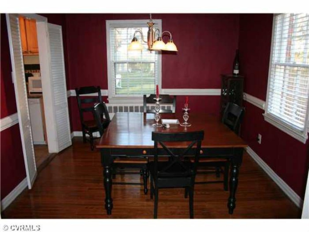
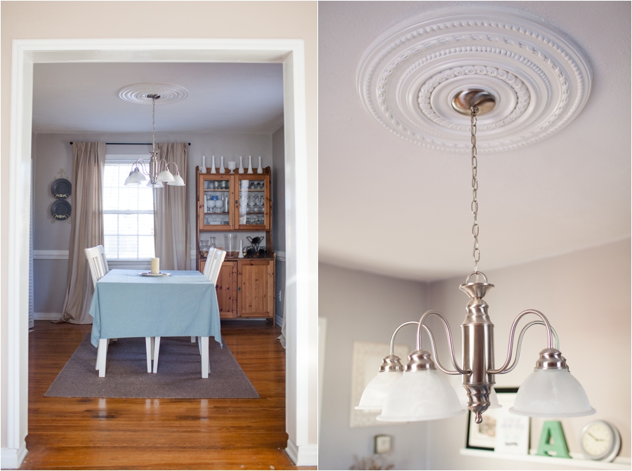
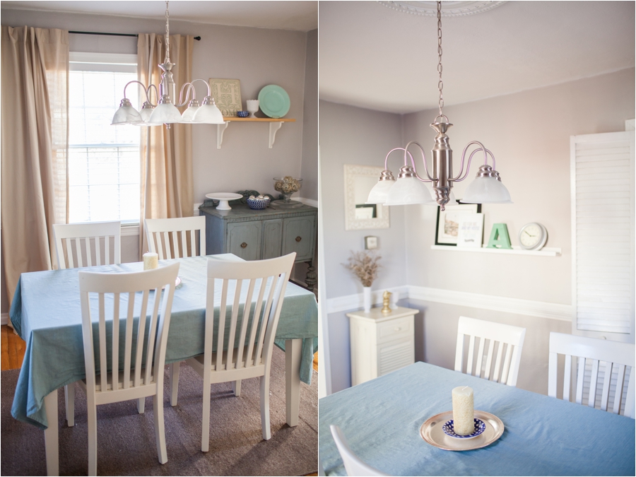
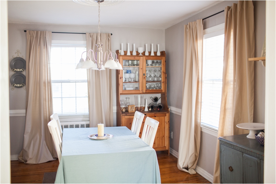
Today I wanted to share the progress we’ve made on the dining room! This room still has a long way to go but I guess that’s why these are called progress posts rather than makeover posts! When we first looked at the house and I walked into this room..I knew the paint color had to go right away..I think it’s a Richmond thing to have a deep red colored dining room…but ours is just too small and it made the space feel tiny! So we chose a light grey to make it feel more airy and to give it a modern touch..and I love what the color did for the space! I would paint every room in my house grey if that wouldnt be weird…
I love the space because the colors feel so much more calm and relaxing now…If I’m being honest, most of the time we eat dinner in the living room with Grey’s Anatomy turned on on Netflix..but we are trying to be better about eating in here and having dinner be a more intentional time together!
The reason I wanted to share this room next is because soon Ryan is going to start in on renovating our kitchen! So the first thing to go is going to be that wall in between the dining room and the kitchen to make our old house feel more open and to add a bar to make it a better space for entertaining and having guests over!
Here’s the before from the realty website…kind of blurry but it gives you an idea of what the walls looked like! Yikes:
And here’s the progress!! Isn’t it amazing what paint can do? And curtains? Also you’ll have to forgive me because I just noticed how horribly wrinkly our table cloth is…
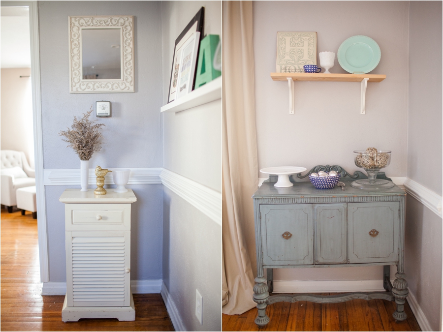
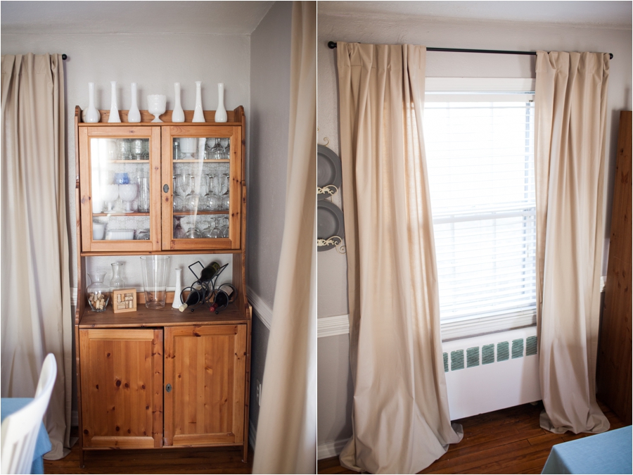
That piece on the left was my dad’s and currently holds a ton of our glasses and dish ware because our cabinet space is super limited until we redo the kitchen…Eventually we want to add double doors to the outside backyard patio on that wall to make it feel even bigger and more open!
Hopefully I’ll be sharing these posts more frequently as Ryan starts work on the kitchen and getting rid of that wall!
Happy Thursday!!
May 9th, 2013 at 5:14 pm
I love it!! The colors are so soothing! Love the ceiling light detailing! :)
May 9th, 2013 at 5:31 pm
SOO pretty!! Want to come down to North Carolina & help me decorate my new house?! At least keep this series comin! ;)
May 9th, 2013 at 5:51 pm
Agreed. Please keep this series coming! I love watching the progress;)
May 9th, 2013 at 7:33 pm
love that paint color! we have been working on redoing our dining room, too. it is SUCH a process! right now i am trying to find wall art…. the walls seem so HUGE it’s hard to figure out what all i need!
May 10th, 2013 at 8:12 am
Beautiful! Love the grey.
May 10th, 2013 at 9:03 am
We totally have the same taste…I’m right there with you in that I would paint my whole house in a soft grey if it wasn’t weird! We just bought a house too and it’s definitely a humbling process to patiently and slowly make a house a home. It looks beautiful!
May 10th, 2013 at 10:23 am
Oh my goodness this looks so good! I also love gray as a paint color! Can’t wait to see more progress posts. :)
May 11th, 2013 at 2:01 pm
so, i love that this matches perfectly with your new blog ;) proof that your branding is SO YOU. love it :)
September 3rd, 2014 at 3:20 am
Wow Anna! This looks so gorgeous! It has a very “french-kitchen-vibe” going on that I absolutely LOVE!!!!